io'n & associates ltd.
brand identity, marketing.

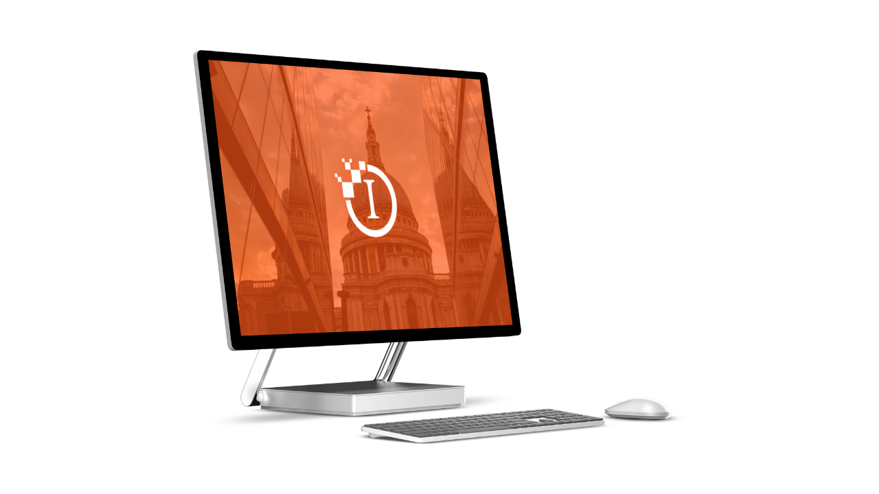
This project was really enjoyable for me and the creative team. We knew that ION needed to look professional and trustworthy, with that feel of a large organisation based in the centre of the capital city. Which is what we and the client believe we have achieved.
The font on the " I " part of the logo has been associated with other corporate brands out there and the container also makes the " I " stand out more. We also knew that, with the company specialising in digital transformation, we needed to include an element of digital and that is when we created the pixels fading out from the top left of the container.
Overall, the company has seen an increase in interest and has already brought on more clients since the re-brand.
Using our extensive network of NHS and private healthcare digital and technology experts we provide businesses and healthcare providers with the best talent to support their transformation.
CEO Founder - ION & Associates.


